Accessible Search Form
Published on:
Last updated: Thursday, September 8, 2016.
If you have a suggestion or an issue please submit it on a11ymatters on Github.
Article Outline
Summary
When building a search component, it's important to take accessibility in mind from the beginning. We will explore some bad things to avoid and then show the final pattern with testing results and videos.
As a user
- As a user, I should be able search by using the keyboard.
- As a user, I should be informed that the field is required.
- As a user, I want to know when the field status is invalid.
- As a user, I should be able to search by clicking Enter key on the input.
- As a user, I need to know what is the purpose of this input.
Ingredients
- form
- label
- input
- aria-required
- aria-invalid
- alert
Things to take in consideration
1- Including a <label> element.
1
2
3
4
<form>
  <input id="search" type="text" placeholder="Search about recipes">
  <input class="button" type="button" value="Search">
</form>
When we don’t have a <label> element, AT (Assistive Technology) users won’t get the meaning of this input, even if there is a placeholder attribute.
Testing results from different screen readers:
-
VoiceOver on Safari: edit text
-
JAWS 17 on IE11: edit
-
NVDA 2016 on Firefox Win: edit has auto complete, blank
-
iOS VoiceOver: text field, double tab to edit
What’s the purpose of this input? The user will have no clue that this is a search input. This is very bad and confusing. As a result, your user will be frustrated and not happy with that.
Solution
1
2
3
4
5
<form>
  <label class="search-label" for="search">Search about recipes:</label>
  <input id="search" type="text" placeholder="Search about recipes">
  <input class="button" type="button" value="Search">
</form>
2- Include a meaningful description in the label
How could that happen? When you add a search icon as an <img>, <svg> or background-image, it’s important to add a text saying Search for example, and hide it with CSS.
In the below example, we have a search icon as a replacement for the text Search inside a <label>.
1
2
3
4
5
6
7
8
9
<form>
  <label class="search-label" for="search">
      <svg xmlns="http://www.w3.org/2000/svg" viewBox="0 0 40 40" >
        <!-- path data -->
      </svg>
  </label>
  <input id="search" type="text" placeholder="Search about recipes">
  <input class="button" type="button" value="Search">
</form>
Let’s see what screen readers will announce.
-
VoiceOver on Safari: edit text
-
JAWS 17 on IE11: edit
-
NVDA 2016 on Firefox Win: edit has auto complete, blank
-
iOS VoiceOver: text field, double tab to edit
It’s the same as not including a <label> element. To solve this, we can try the following:
1- Add a title for the SVG element that will be associated with aria-labelledby attribute.
1
2
3
4
5
6
7
8
9
10
<form>
  <label class="search-label" for="search" aria-labelledby="searchTitle">
      <svg xmlns="http://www.w3.org/2000/svg" viewBox="0 0 451 451" >
        <title id="searchTitle">Search</title>
        <!-- path data -->
      </svg>
  </label>
  <input id="search" type="text" placeholder="Search about recipes">
  <input class="button" type="button" value="Search">
</form>
2- Add text Search inside the <label> and hide it with CSS text-indent.
1
2
3
4
5
6
7
<form>
  <label class="search-label" for="search">
      Search
  </label>
  <input id="search" type="text" placeholder="Search about recipes">
  <input class="button" type="button" value="Search">
</form>
1
2
3
4
5
6
.search-label {
  width: 40px;
  height: 40px;
  background-image: url('search.png');
  text-indent: -9999px;
}
3- Hide the text off screen
1
2
3
4
5
6
7
<form>
  <label class="search-label" for="search">
      <span>Search</span>
  </label>
  <input id="search" type="text" placeholder="Search about recipes">
  <input class="button" type="button" value="Search">
</form>
1
2
3
4
5
6
7
8
9
10
11
12
13
14
15
.search-label {
  width: 40px;
  height: 40px;
  background-image: url('search.png');
}

.search-label span {
  position: absolute;
  clip: rect(1px, 1px, 1px, 1px);
  padding: 0;
  border: 0;
  height: 1px;
  width: 1px;
  overflow: hidden;
}
3- Handling form errors
It’s important to validate your forms for accessibility. In case the user didn’t enter anything in the field and pressed on button, it should inform AT that this input is not valid and required.
Adding a <p> element with text like “Your input is not valid” in a red color, is not enough for AT users because it won’t be accessible to them.
1
2
3
4
5
6
<form>
  <p class="form-error">The input is not valid. It must not be empty!</p>
  <label class="search-label" for="search">Search</label>
  <input id="search" type="text" placeholder="Search about recipes">
  <input class="button" type="button" value="Search">
</form>
.form-error {
  color: red;
}
Sighted person
Visually impaired person
Screen readers? Simply the user will get nothing. The error message won’t be seen from the first place because its added as a regular <p> without taking in consideration ARIA and Role attributes.
4- Always include a clear focus style
When the user focuses on the input, we should indicate that in a very clear way. That could be done by:
-
Adding a thick border with a dark color.
-
Adding a glow or a blurred shadow.
-
Changing the background color a bit to be darker.
In general, we shouldn’t depend only on the color to indicate that an input is focused. There are people with color blindness (partial or full) who won’t be able to recognize the color on focus.
Give them other indicators that doesn’t depend on colors, like a thick border or a shadow. Whatever works for your case.
In the below example, we will see how a red border will be seen from the view of a color blindness user.
A Person with normal color vision:
A Person with Deuteranopia color blindness:
Noticed how the border color is almost dark green? This won’t give an idea that this input is not valid. You should add other indicators like a message or an “X” icon for example.
5- If the input is required, indicate that
It’s not enough to add required attribute to the input, AT users won’t get that the input is required.
1
2
3
4
5
<form>
  <label class="search-label" for="search"></label>
  <input id="search" type="text" placeholder="Search about recipes" required>
  <input class="button" type="button" value="Search">
</form>
Let’s explore how the right way to build out component.
6- Where to add role=search
The first thing came to my mind is that role=search should be added to the <form> element. That’s wrong because the <form> element explicitly have role=form. By adding role=search we are changing it’s default semantic.
After some research, I found that a better practise is to add the role inside the <form> element itself, for example a wrapping <div>.
1
2
3
4
5
6
7
<form>
  <div role="search">
    <label class="search-label" for="search"></label>
    <input id="search" type="text" placeholder="Search about recipes" required>
    <input class="button" type="button" value="Search">
  </div>
</form>
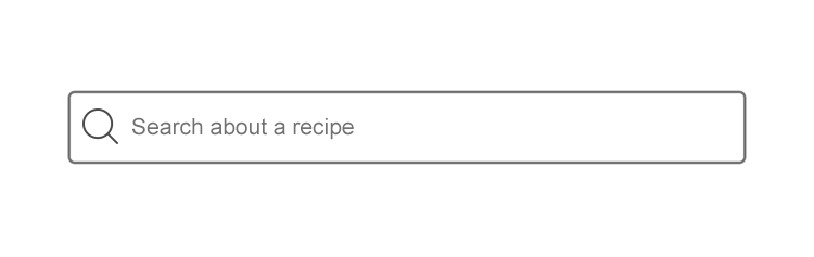
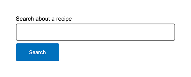
Building the search component
Now we will go through the steps on building an accessible search form. Below is the end result we want to achieve:
HTML
1
2
3
4
5
6
7
<form>
    <label class="search-label" for="search">Search about a recipe
      <p id="error" role="alert"></p>
    </label>
    <input id="search" class="search-input" type="text" aria-describedby="error">
    <input class="button" type="button" value="Search">
</form>
-
We have a
<label>with a proper and easy to understand description. Then, inside the<label>we have a<p>element withrole=alertattribute. This will help screen readers to get the error text in case the input was not valid. -
Our input, with
aria-describedby="error". That’s mean when the user focuses on the input and it’s not valid, the validation error will be announced based on the element withid=error. -
Search button.
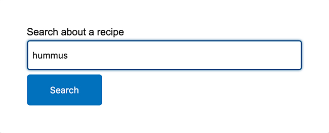
Focus style
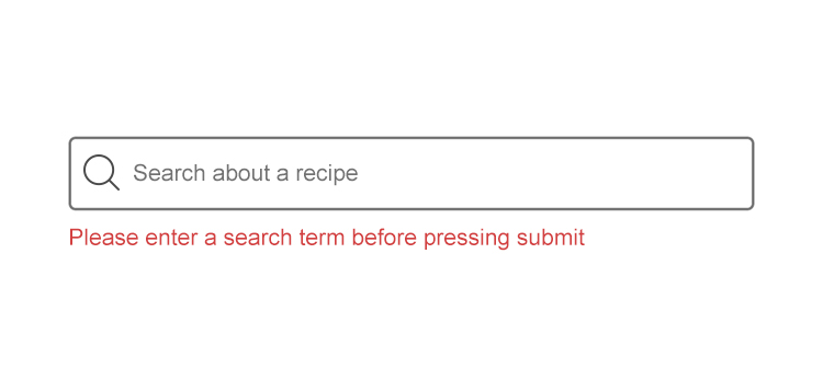
Form error

Enough visual, let’s see how screen readers will understand our simple search form!
Input Focus
-
VoiceOver on Safari: search about a recipe, edit text
-
JAWS 17 on IE11: search about a recipe, edit
-
NVDA 2016 on Firefox Win: search about a recipe, edit
-
iOS VoiceOver:
Form Error (Search when the input is empty)
-
VoiceOver on Safari: You need to enter a search term before pressing submit, You need to enter a search term before pressing submit
-
JAWS 17 on IE11: Search about a recipe, You need to enter a search term before pressing submit, edit invalid entry, You need to enter a search term before pressing submit
-
NVDA 2016 on Firefox Win: alert, You need to enter a search term before pressing submit
-
iOS VoiceOver:
Issue(s) we have
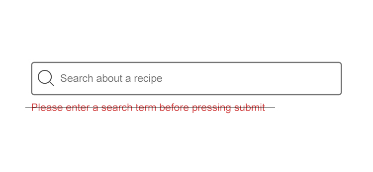
Reading the error message twice
JAWS and Safari read the error message twice, which is not what we want. Mainly the issue was because we are using aria-describedby to let screen readers get the error, in addition to adding the error inside the <label> element. This will result in reading the error message twice!
Testing with VoiceOver on Safari
HTML after removing aria-describedby:
1
2
3
4
5
6
7
<form>
    <label class="search-label" for="search">Search about a recipe
      <p id="error" role="alert"></p>
    </label>
    <input id="search" class="search-input" type="text">
    <input class="button" type="button" value="Search">
</form>
Testing with VoiceOver on Safari after removing aria-describedby
So we no longer need aria-describedby, we have an alert that will do the job.
Final Demo
See the Pen a11ymatters - Search with role by Ahmad Shadeed (@shadeed) on CodePen.
Share the article:
Did you like the article? Share it on Twitter
Did you like the article? You can hire me.
I'm a UX, UI Designer and Front End Developer. I focus on building accessible and easy to use websites and apps. Get in touch by email: [email protected]