Accessible Mobile Navigation
Published on:
Last updated: Sunday, September 18, 2016.
If you have a suggestion or an issue please submit it on a11ymatters on Github.
Article Outline
Summary
How we should build a mobile navigation pattern? In this article we will go through different ideas and scenarios to build a better mobile navigation.
As a user
- As a user, I should be able to open the navigation with a keyboard.
- As a user, I should be able to navigate even if JavaScript is not available.
- As a user, I should be able to navigate using my screen reader
Ingredients
- button
- link
- aria-expanded
Things to take in consideration
1- Use a semantic element for the toggle button
It’s easy to use a <span> with a button-like styles to make it look like a real button. This is bad because with the absence of CSS or JS, it won’t work.
1
2
3
<span class="toggle">
  Menu
</span>
1
2
3
4
5
6
7
8
9
.toggle {
  display: inline-block;
  width: 100px;
  padding: 10px;
  background: green;
  color: #fff;
  cursor: pointer; /* Just in case someone hovers on it ;) */
  border-radius: 5px;
}
2- Use a semantic element for the nav
1
2
3
4
5
<nav role="navigation">
  <ul>
    <!-- menu items -->
  </ul>
</nav>
Using HTML5 <nav> element is very important. It will let screen reader users know that this website has a navigation. Also, it’s important to add role=navigation to ensure better support, since not all browsers/screen readers will recognize the <nav> element.
It’s not good to use a regular <div> element for such an important part to wrap your menu items. for instance:
1
2
3
4
5
<div class="nav">
  <ul>
    <!-- menu items -->
  </ul>
</div>
Unfortunately, this is not recognizeable by screen readers. It’s possible to make this work by adding role=navigation but it’s always better to use the native <nav> element.
3- Don’t hide the <nav> element
The <nav> is an important part of any website. A screen reader user need to scan the website landmarks before starting to navigate. In case the <nav> element is hidden, the user will be confused and close the page immediately.
How is that possible?
As Heydon Pickering pointed out that we should place the toggle button inside <nav>. Now if you want to hide the navigation links in small screens, you should only hide the <ul> that’s wrap them. Then, the button element will be placed somewhere, for instance, at the top right corner of the screen.
Let’s explore different cases for hiding the navigation on small screens.
3.1 - Hiding whole <nav>
This is a common pattern. The toggle element is added outside the <nav>, mostly inside the <header> element and with JavaScript we can add the functionality to make it work.
1
2
3
4
5
6
7
8
9
10
<header>
  <button>Menu</button>
  <nav>
    <ul>
      <li><a href="/about">About</a></li>
      <li><a href="/contact">Contact</a></li>
      <li><a href="/faq">FAQ</a></li>
    </ul>
  </nav>
</header>
In CSS, we add a class that will toggle the display of the <nav> element. For instance, is-active class.
1
2
3
4
5
6
7
nav {
  display: none;
}

nav.is-active {
  display: block;
}
And then in JavaScript, we are saying that when the user clicks on the button, add is-active class to the <nav> element.
1
2
3
button.addEventListener('click', function(){
  nav.classList.add('is-active');
});
Testing Result on macOS VoiceOver
Notice that it didn’t announce the button is related to the <nav> element. This is confusing and not good for the user.
Let’s now see what landmarks we have in the page with VoiceOver by using the shorcut (CTRL + Alt + U) while VoiceOver is running.
Users can scan the current landmarks (main, aside, header, nav.. etc) in a web page. And in our example, we have the <header> (banner) and <nav>. When hiding the <nav> with CSS, it won’t be accessible and users won’t be able to scan it.
DEMO
See the Pen a11ymatters - Nav: Button outside by Ahmad Shadeed (@shadeed) on CodePen.
3.2 - Hiding the <ul> inside a <nav>
This approach means that the <nav> will stay displayed and only the <ul> inside it will be hidden with CSS.
1
2
3
4
5
6
7
8
9
10
<header>
  <nav>
    <button>Menu</button>
    <ul>
      <li><a href="/about">About</a></li>
      <li><a href="/contact">Contact</a></li>
      <li><a href="/faq">FAQ</a></li>
    </ul>
  </nav>
</header>
As you see, we moved the <button> element to be inside our <nav>. Now with JavaScript, we will toggle the display of <ul>.
1
2
3
4
5
6
7
ul {
  display: none;
}

ul.is-active {
  display: block;
}
1
2
3
button.addEventListener('click', function(){
  ul.classList.add('is-active');
});
Testing Result on macOS VoiceOver
Notice that when we focus on the button, it says “Menu, button navigation 1 item”
Now when looking for the page landmarks in VoiceOver, we should see the banner and the navigation elements.
DEMO
See the Pen a11ymatters - Nav: Button inside by Ahmad Shadeed (@shadeed) on CodePen.
4- Progressive Enhancement
In the previous examples, we explored different ways to include the toggle element for our navigation. If you noticed, we are depending on JavaScript to toggle the nav. But, what if JavaScript was not enabled, or there was an error or something preventing the user browser from getting it?
The short answer is, unfortunately, the user won’t be able to navigate.
What we are aiming for is to progressively enhance the experience, just like the following design.
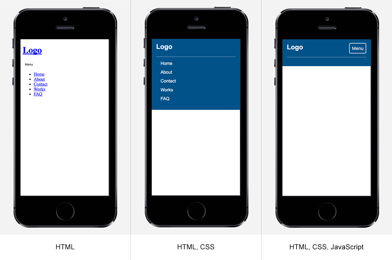
-
HTML only. In that case, the user will see both the button and the navigation list. Now our JavaScript powered button is useless and doesn’t do anything.
-
HTML, CSS. Same as the previous but with a better look and feel. Notice that our button is not there, why? We will look into that shortly.
-
HTML, CSS, JavaScript. Ok, now we have our button and the navigation menu is hidden. We can click on the button and toggle the display of the menu.
In order to achieve the above functionality, we need to do the following:
-
Hide the button with CSS.
-
Check if JavaScript is available.
-
No JavaScript: keep the navigation menu.
-
JavaScript: hide the navigation menu, show the button with CSS.
We will suppose that JavaScript is not available and so we will enhance the experience based on that.
3.1 - Hide the button with CSS
We don’t need the button when JavaScript is not available.
1
2
3
button {
  display: none; /* button is hidden by default */
}
3.2 - Check if JavaScript is available
There are various ways of checking if JavaScript is available. For example, we can add a script that will add the class js to the HTML element, and then we will scope our enhanced CSS to that class.
3.3 - No JavaScript: keep the navigation menu
In that case, the button will be hidden and the menu will be shown.
3.4 - JavaScript is available
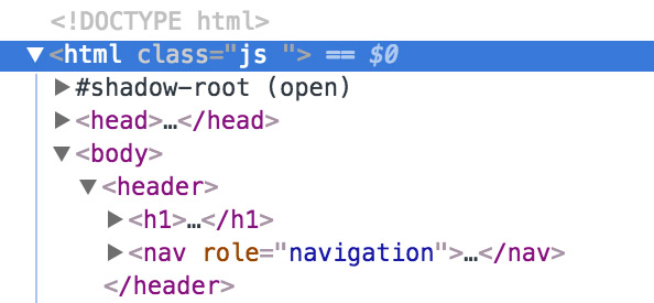
Notice that the html element has the class js. Based on that, we can scope styles like so:
1
2
3
4
5
6
7
.js ul {
  display: none; /* hide the navigation list when JS is available */
}

.js button {
  display: block; /* show the button JS is available */
}
Now when the screen is bigger and there is enough space, we will show the navigation and hide the button.
1
2
3
4
5
6
7
8
9
@media (min-width: 700px) {
  .js ul {
    display: block;
  }

  .js button {
    display: none;
  }
}
5- The toggle design
5.1 - Using symbols for the toggle button content
1
2
3
4
5
<button>
  Menu
  <span class="close-icon">×</span>
  <span class="burger-icon">☰</span>
</button>
In this approach, we are adding the hamburger icon to the button, once the user toggle it, the hamburger icon will be hidden and replaced with the close icon.
This is bad. Screen readers will read those symbols in a weird names which is very confusing. At least, they should be hidden from screen readers by using aria-hidden attribute.
Testing results from VoiceOver
-
×: menu times, toggle button navigation 1 item
-
☰: menu trigram for heaven, toggle button navigation 1 item
5.2 Always include menu as text
The toggle button must have the text of “Menu”, even if you only want to show the hamburger icon. For instance, you can do something like the following:
1
2
3
<button>
  <span>Menu</span>
</button>
1
2
3
4
5
6
7
8
9
10
11
12
13
button {
  background: url('hamburger.svg');
}

button span {
  position: absolute;
  clip: rect(1px, 1px, 1px, 1px);
  padding: 0;
  border: 0;
  height: 1px;
  width: 1px;
  overflow: hidden;
}
With that, we will ensure that screen reader users will get the meaning of this button. Also, when CSS is not working, the background image won’t be available. Without including the text “Menu”, the button won’t be usable.
5.3 be sure to make it big enough for the human thumb
Make sure that the button dimensions are good enough. Read this great writeup on Smashing Magazine.
What element we should use for the toggle?
I think that this depends on the project itself. From my personal opinion, I see that using the humble <a> is good for that. Why? because we can add the <ul> menu ID inside the href attribute of that link.
That way, it will be usable in all cases, even without JS, when clicking on the link it will move/scroll down to the menu location.
Using aria attributes for the toggle element
By using aria-expanded attribute, the user will be able to know that the button content is expanded or collapsed. At first, we will add the attribute by default and then JavaScript will help us in changing the value.
1
2
3
4
5
6
7
8
<header>
  <nav role="navigation">
    <button id="toggle" aria-expanded="false">Menu</button>
    <ul id="menu">
      <!-- menu items -->
    </ul>
  </nav>
</header>
1
2
3
4
5
6
7
8
9
10
11
12
var toggle = document.querySelector('#toggle');
var menu = document.querySelector('#menu');

toggle.addEventListener('click', function(){
  if (menu.classList.contains('is-active')) {
    this.setAttribute('aria-expanded', 'false');
    menu.classList.remove('is-active');
  } else {
    menu.classList.add('is-active');
    this.setAttribute('aria-expanded', 'true');
  }
});
Testing result from VoiceOver
And as per the WAI-ARIA spec:
If the element with the aria-expanded attribute controls the expansion of another grouping container that is not ‘owned by’ the element, the author should reference the container by using the aria-controls attribute.
We should also use aria-controls attribute on the toggle element, inside it we should reference the ID value of the <ul> element. See the below example:
1
2
3
4
5
6
7
8
<header>
  <nav role="navigation">
    <button id="toggle" aria-expanded="false" aria-controls="menu">Menu</button>
    <ul id="menu">
      <!-- menu items -->
    </ul>
  </nav>
</header>
Final Demo
See the Pen a11ymatters - Nav: Button inside FINAL by Ahmad Shadeed (@shadeed) on CodePen.
Share the article:
Did you like the article? Share it on Twitter
Did you like the article? You can hire me.
I'm a UX, UI Designer and Front End Developer. I focus on building accessible and easy to use websites and apps. Get in touch by email: [email protected]