Accessibility Audit for Aljazeera English Website
While checking my Twitter feed, I noticed a tweet of a medium article on the redesign of Aljazeera.com. As a curious designer, I read the whole article and loved the new design. But, in terms accessibility, there are a lot of missing things in the website. I will point out all issues that make browsing hard for keyboard and screen reader users.
Kindly note that the goal of this article is to learn only, I’m not attacking Aljazeera or something. I care about accessibility and so all of the issues I will mention in the article should benefit us to build better experiences on the web.
1. <html> element needs a lang attribute
It’s important to add the lang attribute to the <html>. By doing so, screen readers will announce the document language.
2. Images should have an alt attribute
In the header, there is a link “Live” with a play icon on the left side. It works well with a mouse.
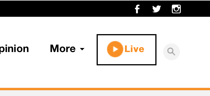
<a href="#">
  <img src="/img/nov-2016/WatchNowPlayIcon_V1.png">
  <span>Live</span>
</a>
Alright. We have a couple of issues in the markup above:
2.1. The href value is empty
This is very confusing, it looks like this should be a <button> instead because it toggle a dropdown menu. The link is here to add the behaviour of a button, by showing the mouse pointer.
2.2. The alt attribute is not available
When the link is focused from keyboard, the image name “WatchNowPlayIcon_V1” will be read. We can leave the alt value empty because we already have the text “Live” inside the link.
By leaving the alt empty, screen readers won’t notice that image at all.
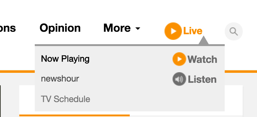
2.3. The dropdown is inaccessible to keyboard and screen reader users
It only works if you hover in mobile. Hitting enter from the keyboard doesn’t help, because the href value is empty. It will does nothing to us. Listen to the audio below, this is what a screen reader user will hear if he focused the link.
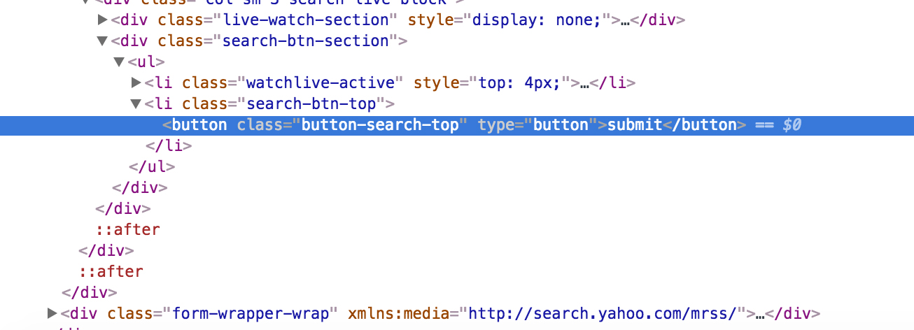
3. Search functionality
3.1. Search button should be more descriptive
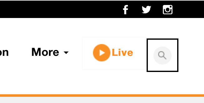
Currently, when focusing on the search icon with a screen reader, it doesn’t give any indicator that there is a search in there. Listen to the below audio:
Submit button? What do I need to submit? This is confusing. Isn’t it?
Since the button toggle the visiblity of the search form, we should wrap it inside an element along with the <form> element and taking in consideration all required ARIA roles and attributes.
As a fix for that, we will need a toggle button for the search form and inside the <form> we will have the input and search button. By adding role=search to the <form> inner wrapper, we will ensure that this will be recognized as a search landmark for screen readers.
1
2
3
4
5
6
7
8
9
10
11
<div id="search-wrapper">
    <button id="btn" aria-expanded="false" aria-controls="searchForm">Open Search</button>

    <form id="searchForm" aria-hidden="true">
      <div role="search">
        <label for="searchInput">Search about recipes:</label>
        <input id="searchInput" type="text" placeholder="Enter text..">
        <button>Search</button>
      </div>
    </form>
</div>
Line 2: aria-expanded will provide us with an indicator that whether the input is collapsed or expanded. It acts as a toggle button.
Line 2: aria-controls has the value of the input ID, which means that the button is controlling that input. In our case, by visibility.
var toggleButton = document.querySelector('#btn'),
    searchForm = document.querySelector('#searchForm'),
    searchInput = document.querySelector('#searchInput');

toggleButton.addEventListener('click', toggleSearch);

function toggleSearch(e) {
  e.preventDefault();
  searchForm.removeAttribute('aria-hidden');
  toggleButton.setAttribute('aria-expanded', 'true');
  searchInput.focus(); /* Move focus to the input */
}

function checkKey(e) {
  if (e.keyCode === 27) {
    closeSearch();
    toggleButton.focus(); /* Move foucs back to the toggle button */
  }
}

function closeSearch() {
  searchInput.setAttribute('aria-hidden', 'true');
}[aria-hidden='true'] {
display: none;
}4. Links should have a descriptive text
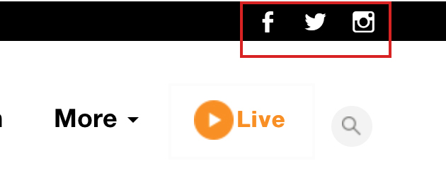
Notice that inside the link, there is no text. We only have a <span> and 2 icon-font-related classes. This is not correct. Users won’t get any useful information on focus.
<div class="col-sm-2 pull-right pre-header-socials">
  <a href="http://www.facebook.com/aljazeera" target="_blank">
    <span class="genericon genericon-facebook"></span>
  </a>
</div>
Listen to the below audio:
A link for what? so that’s the issue. Users will be confused by that and we should provide an alternative text. We have a couple of options:
-
Adding text inside the
<span>and usingtext-indentin CSS to hide it. -
Hide the text visually and leave it for screen readers only.
5. Focus styles for the links
Without focus styles, navigating with a keyboard won’t be possible because you won’t be able to see which element is currently focused. I noticed the following CSS:
* {
    outline: none !important;
}
By adding outline: 0, this will prevent users from navigating with keyboard. Any user could run into this issue, suppose that you want to move to a specifc link while your mouse/touchpad is not working. You won’t be happy.
If you don’t like the default focus style (that blue focus ring), it’s totally fine. You can add a custom one. Don’t reset it to zero, please.
Here is an example of a custom focus style:
.nav-link:focus {
    outline: 1px dotted blue; /* Overriding the default focus style. */
    color: #FA9000;
    text-decoration: none;
}
6. Source order Vs. Visual order

While navigating the header links, I noticed that “Live” link is the last link to be focused. The developer placed it visually at the right side. In reality, it should come after “Somalia” link (the second row navigation links).
Currently, from left to right we have:
-
Main navigation links
-
Live and Search
-
Topics
But the HTML source is different:
-
Main navigation links
-
Topics
-
Live and Search
See the video to get what I mean:
Did you notice how the focus moved to the topics and then the Live link? A better implementation for this would be to change the source order and make it just like the visual one.
7. Skip to content link
It’s important to provide the user with the ability to skip navigating all links. We can add a skip link before the header, it will move the user right to the primary content of the page. Read this article for more info.
If this is implemented, it will be something like this:

This link will appear once we tab with the keyboard. For such a news website with a lot of links, it’s really important to be added. Read this article for more info.
8. Zooming on mobile must be enabled
As a user, I need the ability to zoom-in or zoom-out a web page in my mobile touch screen. Whatever the reason is, the user should be able to zoom.
<meta name="viewport" content="width=device-width,
initial-scale=1.0, minimum-scale=1.0 maximum-scale=1.0, minimal-ui">
To allow zooming, minimum-scale and maximum-scale must be removed.
9. The absence of landmarks
Landmarks helps the user get a general idea about the page elements like header, main content, footer, search.. etc. With VoiceOver, we can show the landmarks list by pressing on CTRL + ALT + U and then navigating with the arrow keys until we reach the landmarks.
Currently, we have this list of landmarks:
-
nav
-
video
Let’s explore how to make them better.
9.1 Header
<div id="site-header" class="site-header hidden-xs">
  ...
</div>
We should use <header> in that case, it’s more semantic and screen readers will recognize it as a banner for the website.
9.2 Navigation
The most important element in the page. They only added <nav> for the topics links, which is considered secondary navigation. The main items (News, Middle East, Documentaries..etc) should be inside a <nav> element.
It’s fine to add both primary and secondary navigation in separated <nav> elements. With the addition of aria-label to each of them, like the following:
<nav aria-label="Primary Navigation">
  <ul> ... </ul>
</nav>
<nav aria-label="Secondary Navigation">
<ul> ... </ul>
</nav>Screen reader users will be able to choose between the primary or secondary landmarks.
9.3 Main content
The main content is not wrapped inside a <main> element, we only have a bunch of <div>s. The current state is like the following:
<div id="placeholder1" type="content">
  ....
</div>
The correct way is to make it like this:
<main id="placeholder1" type="content">
  ....
</main>
9.4 Footer
The same as the header, we should use <footer> along with role=contentinfo so screen readers could recognize it as well.
<footer role="contentinfo">
  ....
</footer>
After fixing the elements, the a screen reader should see the following list of landmarks:
-
Banner (header)
-
Navigation (Primary)
-
Navigation (Secondary)
-
Main
-
Content Info (footer)
10. Topics menu markup

<nav class="nav-topics nav-wide">
  <ul>
    <li id="NavTopTopics">Topics:</li>
    <li><a href="/topics/events/election-2016.html">US Elections 2016</a></li>
    <li><a href="/topics/country/syria.html">Syria's Civil War</a></li>
    ....
  </ul>
</nav>
As you see, the title “Topics:” is added as a <li> element, but without a link. This is not correct. We can simply add an appropriate heading (h3 for example) as a direct child of <nav>.
Also, we will add aria-label with the value of “Topics”, so screen reader users will be able to get an idea of what’s inside this navigation list.
<nav aria-label="Trending Topics">
  <h3>Topics</h3>
  <ul>
    ...
  </ul>
</nav>
11. TV Schedule
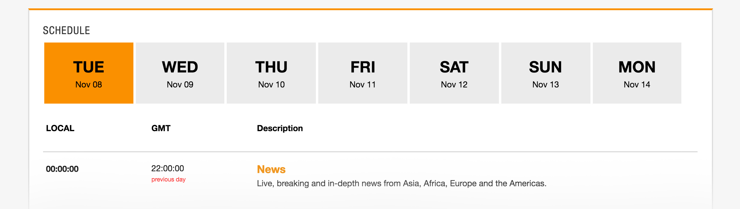
The schedule days are built out of <div>s. They added some CSS to make it look like a button, for example: cursor: pointer will show a pointer when hovering on the <div>.
<div tabindex="0" class="day" id="Nov_08_Tuesday"
onclick="SelectSchedule('Nov_08_Tuesday')">
  <div>
    <div class="DayOfWeek">TUE</div>
    <div class="MonthDay">Nov 08</div>
  </div>
</div>
Issues in that markup:
-
Not accessible to screen readers.
-
Doesn’t work with keyboard.
-
I can’t copy the link of a day. Because it’s a
<div>and not a real link.
We can build this as list with anchor links:
<ul>
  <li id="tues" class="day">
    <a href="/news/tues-4-nov/index.html">
      <span class="DayOfWeek">TUE</span>
      <span class="MonthDay">Nov 08</span>
    </a>
  </li>
</ul>
12. Dropdown menus

All the dropdown menus work fine with mouse. But with keyboard, it’s not possible to explore the list of links in each dropdown. A good solution is to make the <a> link as a button with aria-pressed attribute. Once clicked, it will move keyboard focus to the first link in the dropdown.
<ul>
  <li>
    <a href="#" role="button" aria-pressed="false">News</a>
    <ul id="sub-menu">
      <li><a href="#">Tech</a></li>
      <li><a href="#">Sport</a></li>
      <li><a href="#">Middle East</a></li>
    </ul>
  </li>
</ul>
That way, all users will be able to access the dropdown. Whether they are using a mouse/touch/keyboard. I will explore the solution with more details in an upcoming article.
That’s all for now. And again, the article goal is only for learning purposes. Let me know if you have any comment or suggestion!
Thank you for reading.
Share the article:
Did you like the article? Share it on Twitter
Did you like the article? You can hire me.
I'm a UX, UI Designer and Front End Developer. I focus on building accessible and easy to use websites and apps. Get in touch by email: [email protected]