Accessible Checkbox
Published on:
Last updated: Tuesday, September 17, 2019.
If you have a suggestion or an issue please submit it on a11ymatters on Github.
Article Outline
Summary
How to properly mark up a checkbox and customizing its design taking in consideration that the result is accessible and easy to use.
As a user
- As a user, I should be able to navigate by keyboard.
- As a user, I expect that there will be no animation in case I disabled animations from system preferences.
- As a user, I should see a clear focus style.
- As a user, In multiple checkboxes, I should hear the question or title related to them.
Ingredients
- label
- checkbox input
As per MDN, a checkbox:
<input>of type checkbox are rendered by default as square boxes that are checked (ticked) when activated. They allow you to select or deselect single values in a form.
Default Accessible Checkbox
Let’s mark up a checkbox in HTML.
<input type="checkbox">
<label>Hello, I'm a checkbox</label>
Here is how the above code works:
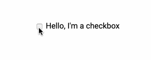
The checkbox can be activated only by clicking on the box only. If the user clicked on the text, it won’t be activated. This is not good.
Associating the label with the input
To achieve that, an ID should be added to the checkbox <input>. Then, this ID will be used as a for attribute for the <label> element.
<input id="c1" type="checkbox">
<label for="c1">Hello, I'm a checkbox</label>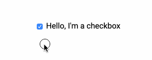
Now, when the user clicks on the input’s label text, it will be activated. This is much better!
Preventing Text Selection
Sometimes, when the checkbox is activated/deactivated, the input’s label text got selected like below:

This can be solved by using user-select in CSS.
label {
    user-select: none;
}
To recap, I laid out the foundation to an accessible checkbox. Here is the final HTML:
<input id="c1" type="checkbox">
<label for="c1">Hello, I'm a checkbox</label>
It’s also possible to wrap the input in the label. In that case, id and for attributes won’t be needed. The association will work out of the box.
<label>
    <input type="checkbox">
    Hello, I'm a checkbox
</label>
Multiple Checkboxes
Or a group of checkboxes. This can be useful for a question that might have multiple answers or selections from the user.
Let’s see how to mark up a question asking about your favorite type of meals. From the first glance, you might think about adding a heading and then to group the checkboxes in a wrapper or something.
<div class="c-group">
    <h2>What's your favorite meal?</h2>

    <div class="c-group__item">
    	<input id="m1" type="checkbox">
    	<label for="m1">Meal 1</label>
    </div>

    <div class="c-group__item">
    	<input id="m2" type="checkbox">
    	<label for="m2">Meal 2</label>
    </div>

    <div class="c-group__item">
        <input id="m3" type="checkbox">
    	<label for="m3">Meal 3</label>
    </div>
</div>
The above might look good for a sighted user. However, for a visually impaired user, the above isn’t accessible. See the below screenshot for how macOS VoiceOver reads that.
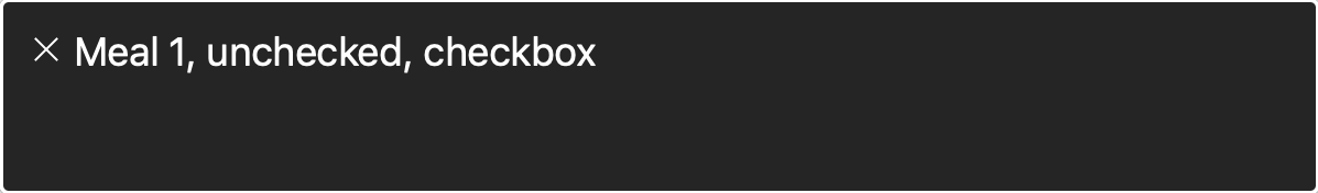
The question “What’s your favorite meal?” hasn’t been read to the user. As a result, when going through the checkboxes, the user won’t know what the context they are in.
Fieldset for the win
By default, there is an HTML element that is suitable for that use case. It can be marked up as below:
<fieldset class="c-group">
    <legend>What's your favorite meal?</legend>

    <div class="c-group__item">
        <input id="m1" type="checkbox">
    	<label for="m1">Meal 1</label>
    </div>

    <div class="c-group__item">
        <input id="m2" type="checkbox">
    	<label for="m2">Meal 2</label>
    </div>

    <div class="c-group__item">
    	<input id="m3" type="checkbox">
    	<label for="m3">Meal 3</label>
    </div>
</fieldset>
Simple, isn’t it? I just swapped the group <div> with a <fieldset>, and replaced the heading with a <legend> element.
Now, let’s see how VoiceOver will read that!
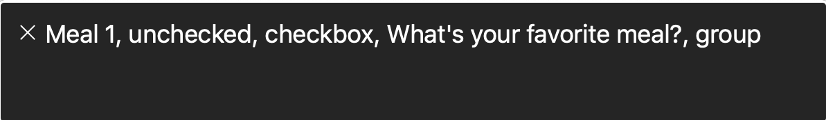
Much better. Now the user can know the context. This is a group and there is a question related to it with multiple answers.
Custom Checkbox Design
Using CSS and Background Images
Most of the time, a custom design for the checkbox is required. Let’s explore how to achieve that.
Since the default checkbox design is not customizable, I will hide it visually and add a pseudo element. By visually, I mean to hide it from the UI and keep it in the DOM for screen reader and keyboard users.
.sr-only {
position: absolute;
clip: rect(1px, 1px, 1px, 1px);
padding: 0;
border: 0;
height: 1px;
width: 1px;
overflow: hidden;
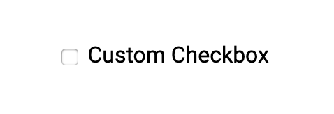
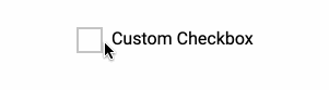
}Now, the input checkbox is hidden and it looks like the below figure.
I added some basic CSS to style a fake checkbox with before pseudo element.
<div class="c-checkbox">
    <input class="sr-only" id="c" type="checkbox">
    <label class="c-checkbox__label" for="c">Custom Checkbox</label>
</div>
.c-checkbox__label {
&:before {
content: "";
display: inline-block;
vertical-align: middle;
width: 20px;
height: 20px;
border: 2px solid #c5c5c5;
margin-right: 8px;
}
}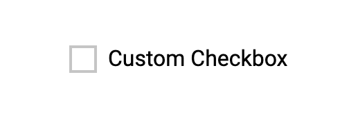
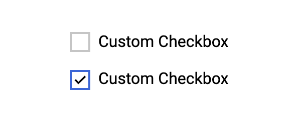
Next, I will add the checked style for the checkbox. Since the input is there, it will be used to select the label before pseudo element.
.c-checkbox input:checked + .c-checkbox__label:before {
border-color: #3863d9;
background: url('../img/checkmark.svg') center/12px no-repeat;
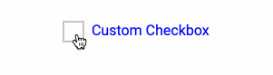
}Result
Using Inline SVG
It’s also possible to use an inline SVG element for the checkmark. That way, you can have a bigger control which can open a lot of possibilities.
In the below example, I placed an inline SVG and animated the checkmark path in CSS with stroke-dasharray and stroke-dashoffset properties.
<div class="c-checkbox c-checkbox--svg">
    <input class="sr-only" id="cs" type="checkbox">
    <label class="c-checkbox__label c-checkbox__label--svg" for="cs">
        <svg viewBox="0 0 100 100">
  	    <path class="path" fill="none" stroke="#000" stroke-width="13" d="M12.1 52.1l24.4 24.4 53-53"/>
	</svg>
        Custom Checkbox
    </label>
</div>
.c-checkbox--svg input:checked + .c-checkbox__label--svg {
&:before {
background: #3863d9;
border-color: #3863d9;
}
.path {
stroke: #fff;
stroke-dashoffset: 0;
}
}
.c-checkbox__label--svg {
padding-left: 32px;
&:before {
position: absolute;
left: 0;
top: -1px;
width: 24px;
height: 24px;
transition: all 0.35s ease-out;
}
svg {
position: absolute;
left: 4px;
top: 4px;
width: 15px;
height: 15px;
}
.path {
stroke-dashoffset: 111.46px;
stroke-dasharray: 111.46px;
stroke: #3863d9;
transition: all 0.35s ease-out;
}
}
Things to Consider When Customizing a Checkbox
Using Pointer Events
In the custom checkbox I built, the checkbox won’t be active when clicking over the SVG tick element. To avoid that, it’s better to add disable pointer events on it.
In the below GIF, I’m trying to click on the square but it’s not working. It’s like being checked for a few milliseconds and then it’s returned to its initial state. That’s because I’m clicking on the SVG element.
.c-checkbox__label--svg svg {
    /*Other styles*/
    pointer-events: none;
}
Focus Styles
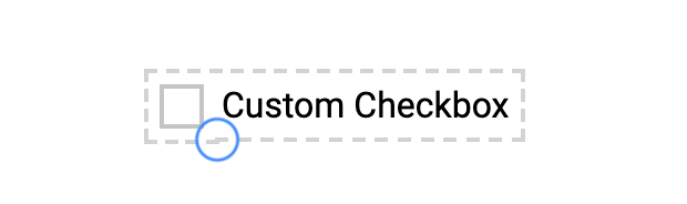
It’s important to care about keyboard users. As a result, the focus style should be added to provide a better experience for those users.
.c-checkbox input:focus + .c-checkbox__label {
    outline: dashed 2px lightgrey;
    outline-offset: 5px;
}
The focus will now work with the keyboard. However, it will still there while using a mouse. The best solution I found to this issue is using CSS :focus-visible which is supported only in Firefox at the time of writing this article.
.c-checkbox input:focus:not(:focus-visible) {
    outline: none;
}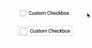
If you’ve noticed, the outline on the first custom checkbox is not a 100% rectangle. See the below figure:
That’s due to that the label itself is an inline element. When adding display: inline-block or display: block to this, the issue is solved and the outline is clear.
.c-checkbox__label {
    /*other styles*/
    display: inline-block;
}
Reducing Animations
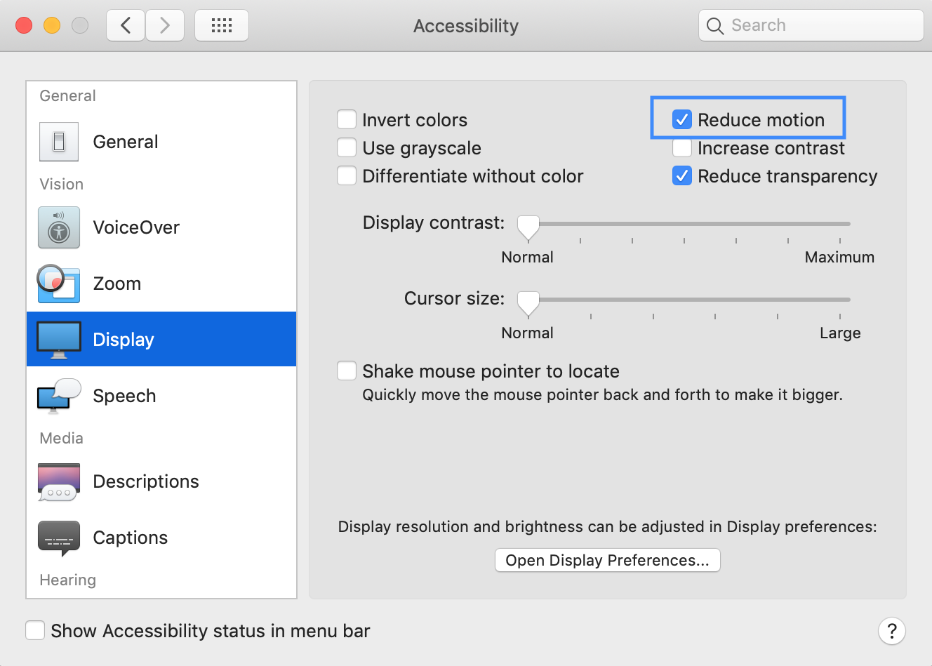
Some users don’t feel comfortable or have issues dealing with animated elements. There is an option in every operating system that let the users disable animations for a better experience.
Here is an example of the accessibility settings in macOS.
For our case, it’s recommended to account for that in CSS and add the following:
@media (prefers-reduced-motion: reduce) {
    .c-checkbox__label--svg .path {
        transition: none;
    }
}
Codepen Demo
See the Pen Accessible Checkbox Demos by Ahmad Shadeed (@shadeed) on CodePen.
Share the article:
Did you like the article? Share it on Twitter
Did you like the article? You can hire me.
I'm a UX, UI Designer and Front End Developer. I focus on building accessible and easy to use websites and apps. Get in touch by email: [email protected]